5 min read
Why your logo matters in your marketing
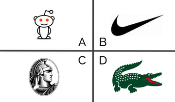
Logos—yes, you could be talking about the philosophical notion describing the principle of order of knowledge. But, in this case, we are talking marketing. Let’s do a quick quiz. Are you ready for a fun test of your observation skills? In the boxes below, I show you four logos. Can you identify the company?
(Click here for the answers.)
How did you do? Differentiating yourself (your brand promise) is critical to business survival. So is communicating the benefits of your brand. Institutions are businesses, but rarely do our logos tell a story about our promise and what makes our school stand out from others. Research on brand logos suggests they offer a viable, albeit often neglected, way to help brand managers achieve goals around distinction and the story of promise.
According to research by Park, Eisingerich, and Pol, logos have three very powerful roles. They are (a) integrators, (b) reflectors, and (c) synthesizers.
First, your logo is the integrator of your marketing efforts of the brand. It ties everything together. No matter your channel of communication, your logo is always there. It is the unwavering icon of your business. When enrollmentFUEL sends anything out to the public, our logo is the driver of our brand. It’s on Boost emails, our Octane magazine, mircoSEARCH™ mailings, and our famous Brainstorming Kits.
Next, your logo is a reflector of your efforts. Let’s use the enrollmentFUEL logo on this litmus test.
It is the icon of what the brand means to you, our customers. When I visit campuses around the nation, I am told by marketing and admission VPs that you recognize our brand, our marketing materials, and that we stand out. Thank you for loving Octane. It has become an integral part of our ecosystem as a community of thought leaders in the industry. (And, secretly, I love seeing them sitting on desks in your office. Are you staging those for my visit?)
Our colors are reflective of a vibrant company. The colors in the logo above have meaning. (If you are interested to learn about the impact of colors, this is a great resource.) Our base color is sable. This is our version of black, which stands for power and authority. Black also represents sophistication. And while we perceive FUEL as “funky and edgy,” our content is always geared to a sophisticated audience of readers—YOU. Our second color above is Aquarium; this is our blue. Blue represents security and trust. These colors are important, as they promote a feeling of security in your choice to partner with FUEL for your Student Search and Strategic Enrollment Management needs. 100% of our client-partners indicated in our most recent independently-sourced satisfaction survey that you trust enrollmentFUEL.
We have two additional colors in our logo—Frolic and Kumquat. Frolic is the green swoosh in our logo, and Kumquat is the orange. Green indicates growth and harmony. This was an important color choice because growth represents success—and everyone wants to partner with a company witnessing success. Harmony aligns with two of our core values—genuine and love. So, it was also an easy choice to select green as a color.
And, we save the best for last—Kumquat. Again, this is enrollmentFUEL’s orange. Of all the colors in our logo palette, FUEL uses this one the most. It represents stimulation and energy. These words carry so much meaning for us because it’s our job to stimulate your enrollment growth, stimulate your curiosity as continuous learners in the field, and stimulate you and your staff with training and professional development as a teaching and learning organization. And, we have to do all of this with energy and excitement. For those of you who are client-partners, you already know about FUEL’s energy level as we work together on Student Search, digital marketing, and financial aid campaigns.
Lastly, a logo serves as a synthesizer. It helps your future customers (students and parents) identify your institution and stand out against the competition. It further helps them understand your differentiators and any positive associations from your marketing efforts.
When FUEL designed our logo, the synthesis part of the equation was perhaps the most imperative of all the features. With that in mind, we wanted to ensure the logo had meaning. I encourage you to look at the logo again.
Look closely at the gauge. What do you see? I bet you see two circles with little legs on them. Actually, these represent two “talk bubbles.” They suggest active communication and an accessibility for idea exchange. The center gauge is a nod to our ability and passion to provide measurable results. Generally, when one thinks of fuel (gasoline or diesel), one wants to have a full tank. In everyday life, a full tank represents a safety net for going the long distance. Our gauge was intended to elicit the same feelings. The needle indicates enrollmentFUEL keeping your tank full—both professionally (enrollment goals) and personally (your mental tank) for the long distance.
In closing, the research by Park, Eisingerich, and Pol on logos shows they carry great power symbolically, functionally, and in terms of sensory benefits. Surprisingly, few businesses (including institutions) trade upon the opportunities logos represent. Sadly, they simply fall short in visually expressing the brand’s values and principles. Logos have significant impact on a customer’s commitment, which in turn can move performance in terms of revenue and profit. If you haven’t taken time to assess the power of your logo in helping you meet goals in terms of intuitional distinction and the power of your promise, it might be time to revisit this small but iconic part of your brand.
C. Whan Park, A. B. Eisingerich and G. Pol. The Power of a Good Logo. MIT Sloan Management Review. October 2013.
Related Articles
Do You Make These 7 Mistakes in Direct Mail?
Introduction from Mike WesnerIn 2011 I attended a session at the Direct Marketing Association’s...
The New Year is the Middle of the Cycle
End of the Year, yet, Middle of the Road
The holidays can arguably be considered one of the best...
5 Data Concepts You MUST Consider for Higher Education Enrollment!
The ever-changing higher education recruitment landscape is filled with data challenges and...
